Adding depth and exclusivity to a stagnated category
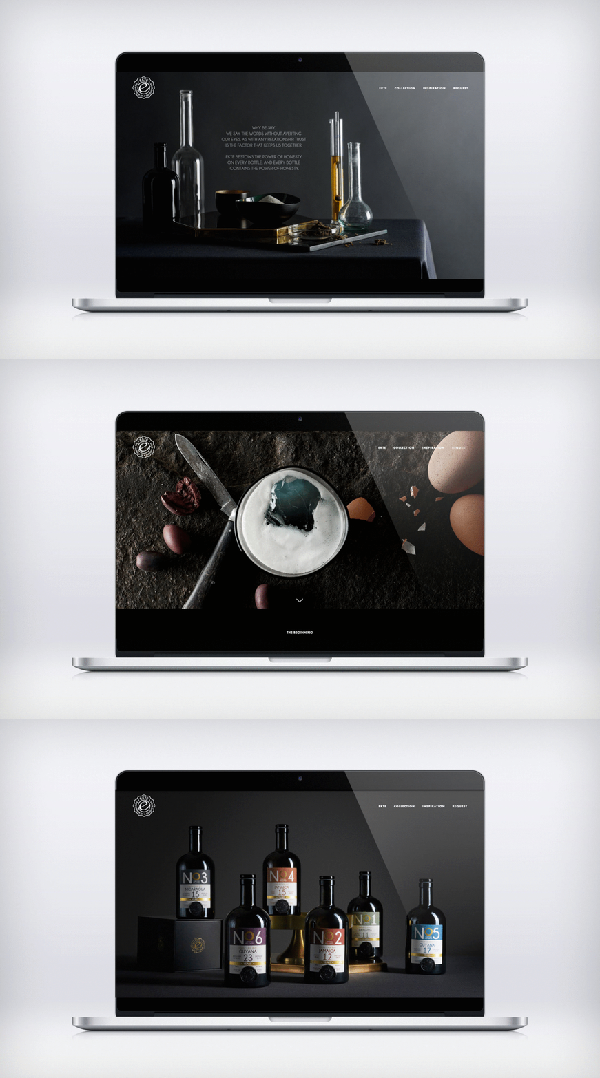
EKTE Spirits is a rum brand born on the foundation of a stagnated rum market, full of pirate imagery and Caribbean associations that lock most rums away from the connaisseur consumer of today. The idea was to launch EKTE on a whole new rum premise: One of nerdy depth and aesthetic exclusivity to signal a rich spirit experience worth a collector’s bar trolley.
The assignment:
End-to-end conceptual design development of the EKTE Spirit rum brand – from packaging and identity to web platform and activation.
Brand universe:
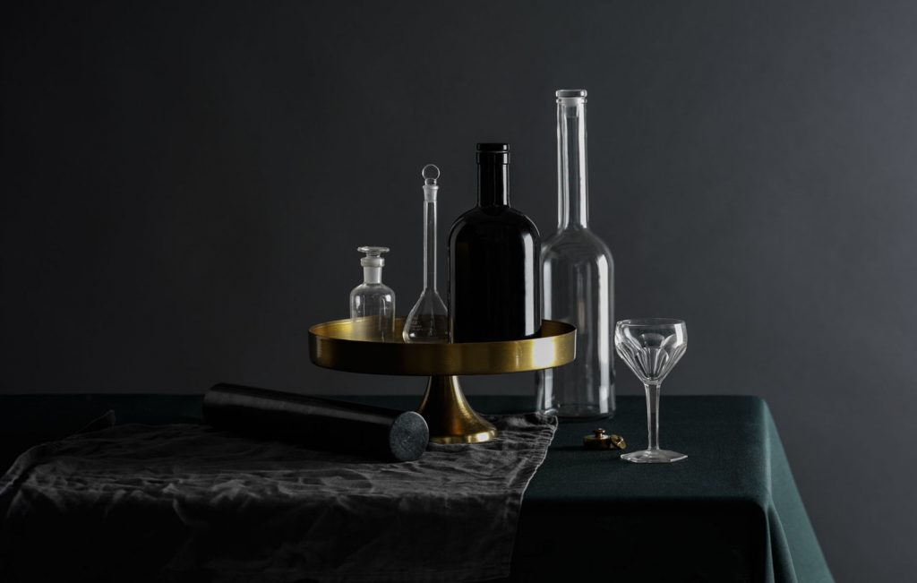
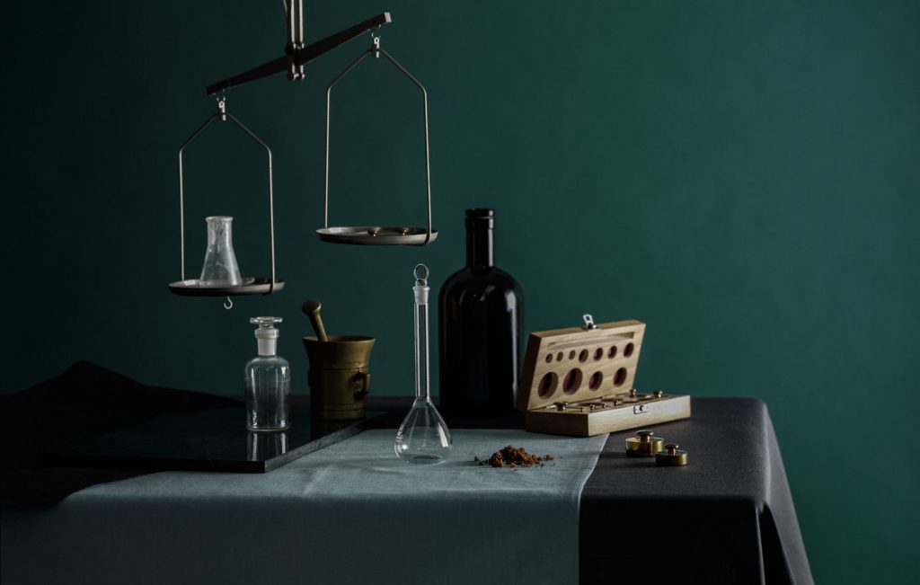
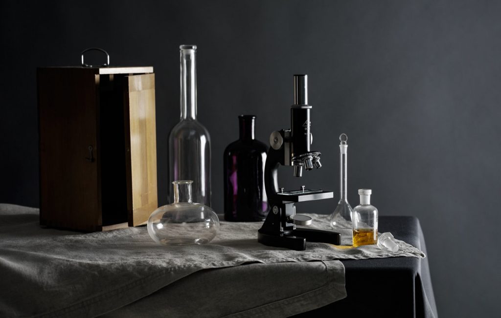
Leaning on the shapes and accessories from traditional apothecaries, Evil Mambo created a visual universe for EKTE that signifies both deep historical routes, fine-tuned nerdery in vintages, blends and complete taste and sensory experience and solidity: The traditional apothecary glass bottle has weight, stability, a solid feel and quality and is aesthetically pleasing in its symmetrical form.
Packaging
With several conceptual lines or collections of rum in EKTE’s range and ever changing batches of vintages and sources, it was essential to keep packaging clean and mature in shape and expression; a solid and calm frame for a variety of informations and codes.
Logo and tagline
Allowing for both the clear individuality of each product and the coherency of a strong and solid brand was achieved through the application of the logo as a seal, where logo monogram and tagline are united to form a unifying expression. As a seal they become a whole where all the brand values are accentuated. The tagline ‘The formula of a curious spirit’ plays on the alkymist’s as much as the connaisseur’s curiosity for new, flavourful universes and experiences and as such binds product and consumer together.
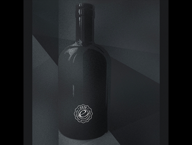
Effects and references
To achieve a timeless, yet stylish brand with an exclusive feel: Art deco, seal, underplayed gold accent on labels, dark backgrounds to create laboratory/experimental feel, soft, calming colours to enhance depth.
